The definitive color guide by designer brand
And the art of color mixing to tell a story, your story.
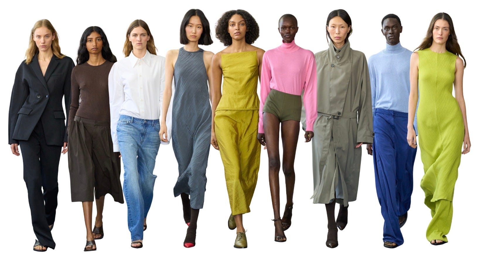
Exploring color as a better way to define my brand turned into finding a better way to express who I am. Let me explain.
The year was 1998, I was interviewed by a NY fashion magazine, and they asked “you’re so bold to show color, how do you convince women to experiment?”
I was thrown by the question. I had recently moved from NYC to Hong Kong, Barneys was at the top of the retail pyramid, and Helmut Lang’s Spring ‘98 RTW collection had a pop of blue on 5 of his 95+ black and white looks. But I had grown up in the South, an island off the coast of Georgia, and wearing color was not only natural, but it was rude not to. Too much black meant you were rebelling. That’s not a bad thing, it’s just factual. Lot’s of black in New York City means you’re blending in. In Los Angeles, it may be someone’s way of saying “I just work here, but NYC is my home.” In London it’s chic, in the country side it’s a misstep.
By the time I had founded Tibi, I’d lived overseas, married an Eastern European, and had a sense of the role color plays in different environments. But I hadn’t yet given much thought to defined a BRAND. My first spring season in 1998 riffed on Hong Kong Lilly (as in Pulitzer), and it happened to coincide with Tom Ford’s Gucci collection that same year that leaned in to the same idea of loud prints, tacky, executed in classic styles.
My first collection launched in the throes of a color explosion trend on the runway. Designers historically grounded in neutrals and black were experimenting heavily. But for them, that was just it, experimentation. But for me, the timing made it such that this was to define my new brand. First impressions, if you will. And I spent a lot of time over the subsequent years fighting with color. I was handcuffed to these saturated shades on a color wheel. Stores and the press told me I was “their definitive color resource.” And to them, grey, navy, black and brown were not colors. They also eventually told me “I’m sorry, we can’t buy your brand right now, our customers just aren’t in to loud colors at the moment.” Damned if you do, damned if you don’t. At one point, I limited my collection to mostly blacks and darker neutrals - if people couldn’t get the point that I was not about bright colors, I’d go to extremes to make it, even if it required I loose a bit of myself along the way.
Decades later, when I created the concept of Creative Pragmatist, and the three adjectives to define my personal style, it was only then that I became comfortable with color. I began to understand how combinations come together to create wholly new and sometimes complex sensations. When I master complexity, I’m happiest. I love being able to explain my choices, if to no one but myself. I feel in control.
I designed a colorwheel that explains, in a highly intuitive way, how different colors work together to create different vibes. Now this is from my own personal pov, but I know that it has resonated with many. When I wear all black, the feeling is quite strong, and sometimes aggressive, depending. When I wear all the classic neutrals (2), I feel secure, smart, but sometimes a bit staid. If I’m head to toe in the ring 3 colors, those are the “ish” colors - they’re difficult to describe (red-ish, brown-ish), I feel very zen, maybe too zen. For me. And if I’m donning only ring 4, it’s quite loud and electrifying.
One ring only = one dimensional feeling, I’m lacking depth, I often crave more. It’s always that pursuit of chill, modern and classic all at once. A range of textures helps combat this feeling.
1+2: gives edge and strength but solidly reliable.
1+3: sharp but softened, so unexpected
1+4: bold (veering on harsh)
2+3: buttoned up but relaxed at the same time; balanced
2+4: preppy, and classic on overdrive (maybe too much for me)
3+4: bright and optimistic but chill, unexpected dimension
Once I realized this was simply the basis of how I dress, it became the foundation of how we approach color in each collection. It’s based on the mood we want to effect and I’m no longer afraid of being pigeonholed into being a brand so tightly defined by the same color story season after season. And that’s liberating.
Just like our city destination color guide, I’ve applied the same to some brands that you’re all familiar with. How to read? In brackets, the color ring that is the core of the brand. A number without brackets plays a big role in the collection. If the number is raised, then it plays a small role in the collection, and if there is an F next to the raised number it means the color is used as a high impact fashion statement.
If you’ve grappled with color, if you turn to a closet and feel you’ve “nothing to wear” when the sheer amount of items you own suggest otherwise, then look deeper to find the culprit. I find many bring in colors to help expand their choices, but alas, they are unwittingly limiting themselves by certain color ring combinations. Like 1+4 or 2+4. You may think five different colors from ring 4 are giving you range, but if you’re always combining them with ring 1, you’re simply compounding a vibe you already have covered.
See what your colors are telling you. Are you complicated and nuanced? Then the brands you love are probably giving you that range in their colors. Before you jump in and try a problem solve in your closet, make sure you have the problem identified first. Color is likely to be patient zero.
We go on to texture next, but that’s for another time.


Amy, I could listen to you talk about color all day. There are many great things about Tibi, but I truly think your colors are EXCEPTIONAL!
No one does colors like Tibi. Loved this breakdown of different brands, had never thought about it this way but it makes sense.
Typically any designer will stick to their vibe and so it makes sense for brands to have color leanings. Curious how you think about designers moving to different brands. I was at Dior recently and saw how the typography on the book totes is just wonky. It’s not perfectly set, it is set as if we were still in the lead setting days with irregular spaces between letters. Now that can’t be a mistake, I wondered if that’s JA’s humor manifesting in a different way at Dior vs Loewe. Maybe we will start to see similar with colors too.
It's incredible how decisive the choice of colors is for individual narratives. This isn't (just) about semiotics; these aren't rigid structures. It's a grammar we can play with to construct stories and identities. Thank you, Amy, for this valuable contribution—it's one of the most useful tools to guide us in our daily choices. After all, we all get dressed every day.