The definitive color guide to packing by city
If you’re a Creative Pragmatist.
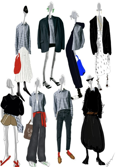
Can you name the city I’m in by my outfit?
It’s hard enough sometimes to figure out what to pack, but there’s a layer of complexity if you’ve never been to the location. And beware, deep diving Google images might just feed you the tropes of the region….which may have you showing up in Vienna wearing a Dirndl and a chunky sock. Very Prada Spring ‘26, but you’re packing here and we need to get real.
Why?
Because showing up in an outfit that “could have been better” can suck, sure, a little. But showing up in utterly the wrong vibe, a suitcase seemingly meant for an entirely different locale all together, can feel like a disaster. Not because you don’t “look good” - they’re your clothes, I’m sure you look good. But you never quite feel like part of your environment - one of the very things we love about a good vacation. Getting away, experiencing something fully, being part of the moment.
ONE OF THE BEST (and easiest) WAYS TO NAIL THE VIBE of a city is to get the color palette right. And before you jump out of your skin because I’m drawing a line in the sand between right and wrong, what I mean is: getting it right based on my own experience, as a Creative Pragmatist, having traveled to all these cities. Ok? So you can take my notes and experiences and decide if it works for you or not. Perfect, let’s go…
First, let’s do a refresher on the Color Wheel. I talk in rings here- the wheel has 4 rings - if you read The Creative Pragmatist you’ll get the full download on how to apply this theory. And no, this is not about a colorist draping fabric across your chest and stating the obvious, that ochre (if you’re me) makes you look like you’ve just eaten sushi from the roadside gas station in Kansas. This way of thinking about color is a game changer, I promise. Color creates a vibe, it can completely change ones mood, it can reflect your environment and help you feel at the way you want to feel. For purposes here, what you should know is ring 1 is Black. 2 are our neutrals - colors that have names - brown, white, grey, tan, etc. Ring 3 are the “ish” colors - brown-ish, green-ish. People debate their names - they have grey and red undertones and they go with literally everything. Worn all together they read extremely casual; but they also work to soften up bright saturated colors (ring 4), and add nuance to the neutrals.
Now that you know the rings, here’s the code on how to read the city guidelines:
The Brackets represent the majority of your suitcase. They are the foundation of your trip. And then the + numbers outside of the brackets represent the remainder. The the numbers are raised, they are more of an accent. If there is a letter “F” next to an item, it means the color is used as true fashion/irony. Milan for example, 4 (the brights) are used as a true fashion moment accent (think a red shiny weird rubbery looking shoe). If there is a Negative next to a number, it means “don’t even bother packing that row.” If a number is raised it means pack it, but go lightly. If it’s outside the brackets but not raised, it means it plays a role in your bag, but not as significant as a role as the numbers in the brackets.
Ok, I won’t exhaust you by over explaining here. Take a peruse of the city lists. Each city I’ve visited I’ve considered the temperature, the terrain and the tone of the people. I’ve then triangulated that with my own personal style as a Creative Pragmatist. For example, I travel to Palm Beach, Florida but it doesn’t mean I show up like a full blown Lilly Pulitzer advert. Rather, I give a nod, keep it grounded in my personal style, and do it in a way that makes me feel just right in the moment I’m in. I think it will make sense to you, especially if you understand the Tibi Colorwheel theory.
Let me know if there are any other key cities you’re curious about. I’ll reach out to other CP’ers to get their input if I haven’t been!
Xo,
Amy


This is literally fashion level 400. It’s calculus for clothes. I love it. I’m not sure I 100% am following but I love it. Now I want to see the formulas in action.
I stood up and applauded. This is amazing, thank you Amy!