

How To Make an Ad
An inside look into the creative process behind our WSJ ad for the CP Book, 2nd Edition.

What goes into creating an ad for The Creative Pragmatist Book 2nd Edition?
Well, let’s go back to the very beginning to why we picked a newspaper versus a social media platform or a fashion magazine to house our concept. You see, we’ve never run an advertisement for Tibi, and as this was going to be our first, we wanted to ensure it spoke directly to not only our customers, but to our brand. Our team avidly reads the WSJ, we often pass articles to one another across our desks, if it was all fashion, all the time, our minds would start to dull. We like places where things are taken seriously, but that never takes itself too seriously. There is an important distinction here - the things we create are inspired by our own diverse needs and wants, and newspaper seemed to be an obvious, albeit unexpected, choice. Something about newsprint, the imperfections of the paper’s texture, coupled with a sense of importance through the content, was very appealing. We love to feel things in our hands, touch and interact physically with the objects in our world, and combing through a newspaper, bending and folding through various pages that have that distinct scent of ink and the hundreds of hands that it has passed through, is an almost sacred type of interaction that just felt right for this project. The phrase “nothing is too precious” is mentioned quite frequently by our team. My most precious items, clothing or not, are the ones I treat decidedly not so. The jeans that are perfectly shredded at the cuff, boots that are worn in just so, or my chef’s knife with a handle that is worn down in just the right places for my hand to rest… and a crinkled WSJ that accompanies me on my journey throughout the city everyday.
Once we determined where the ad would run, I was assigned the task of pulling together the initial ideas for our ideation session. What are graphic designs that grab me? What is the tone of copy that draws me in to stay a while? How do we break through the clutter? And most importantly, how does Tibi, a fashion label, present in an ad for a book? This was exciting for me, I love advertising, always have, and unfortunately, I largely missed its greatest eras - most of my favorite classes in college were about the history, and process, of creative and business advertising.
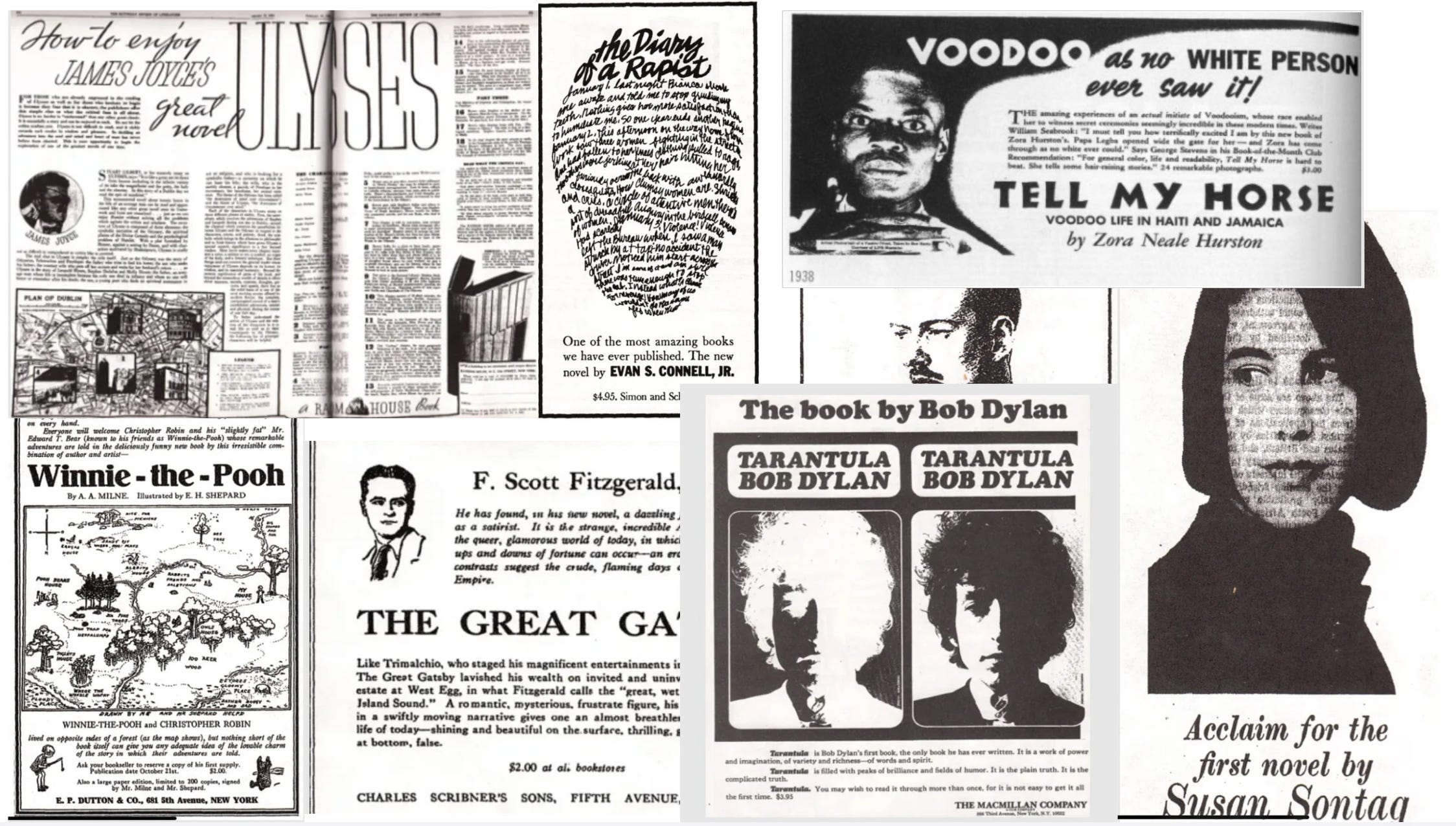
The balance between pushing the bounds to capture interest, while clearly communicating a message and purpose, is interesting to psychologically and emotionally unpack. Sometimes ads can be overwhelmingly bland with no character or message beyond the surface, and for me, it can be extremely frustrating when these types of ads come into my purview. Not only do I feel it represents a missed opportunity, but it also acts as a waste of space in my brain. Other times, seldomly now a days, I come across a beautiful ad that is inspiring and evokes emotion, forcing me to think and reconsider prior notions in my mind about a company or industry. These are the ads I want and welcome in my life. In the words of the great Don Draper, “You are the product. You feeling something. That’s what sells. Not them. Not sex. They can’t do what we do and they hate us for it.” When I’m building an ideation deck, it helps to explore the more obvious places first - it’s like being an inspiration detective, you start with the more usual suspects to see if anything is there, so I went deep into my references to find examples from the literary world and they struck me in a good way. I looked at old newspaper ads for popular books that had immense impact on our culture by authors like Toni Morrison, F. Scott Fitzgerald, and Susan Sontag.
But I knew from the second Amy proposed this project to me, the exact reference I felt most excited about pitching to the team were the Porsche ads from the mid 1960s to the mid 1980s.
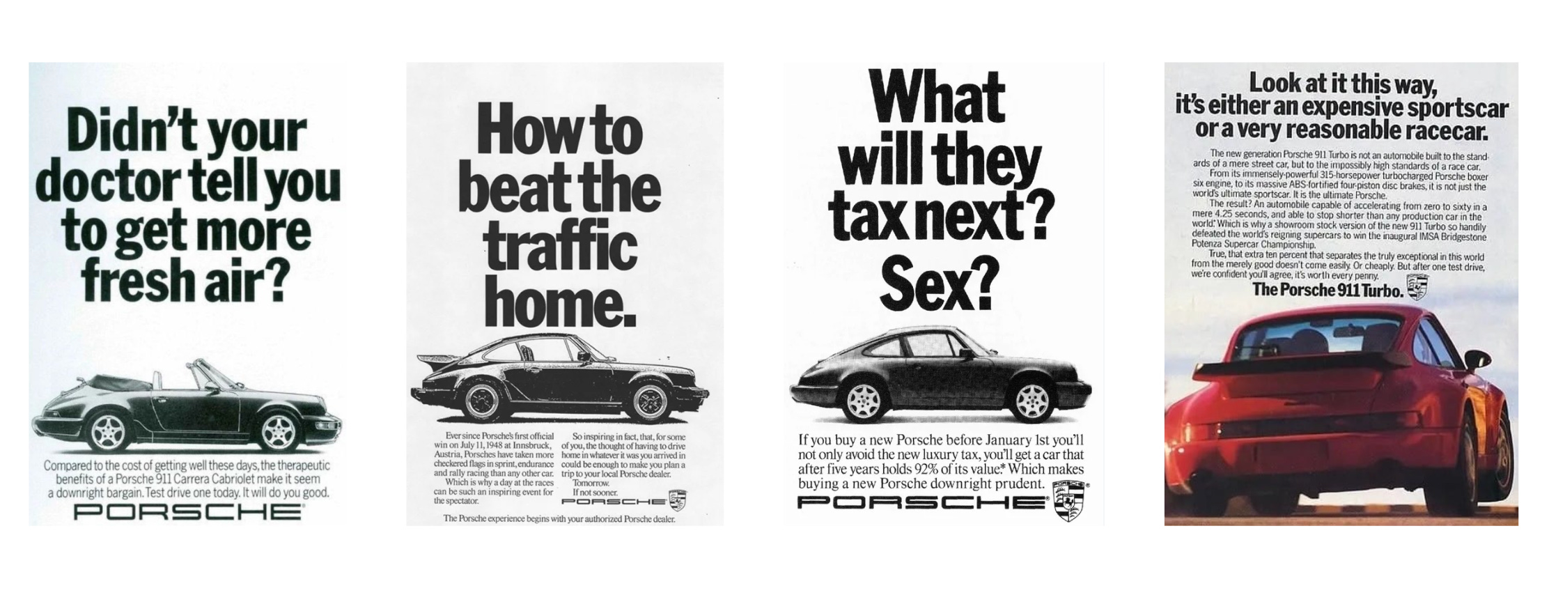
Porsche is my favorite automobile company - they exude elegance, sport, and luxury through an effortless blend of modernity and heritage. Considering the adjectives I associate with Porsche, their ads from the late 20th century become even more intriguing. A fusion of bold faced graphics, a short and pointed catch phrase, accompanied by a few sentences of comical and relatable copy that projects confidence in their product and defines their value proposition, ended succinctly by stating that you’ll be happy you gave it a chance. There is no pandering or wasted space, an appeal to all with a sense of humor, solidifying the loyalty of their aspirational customer while furthering that of their target market.
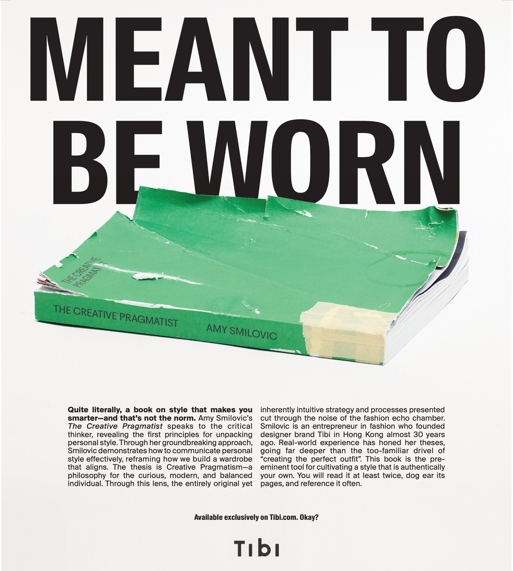
I was extremely pleased in our creative team meeting when my colleagues resonated with the Porsche references in the same way I had. We honed in immediately on the idea of an ad that would be confident, explain the product, and lean in to Tibi’s clever side. There was one moment when we were tossing around ideas where Colleen, our graphic’s designer, said the challenge was to consider that everything at Tibi was “meant to be worn.” If this were a cartoon, the words would be hanging in the air. Amy grabbed them and said yes, that’s it. Exactly it. The book is meant to be worn, but in a different way - through passionate reading and consumption of the words. There was total and immediate group consensus, it’s so cool when that happens, and like that, in just one meeting, we decided upon the creative direction for our ad and the tag line of “Meant To Be Worn”. Amy took a stab at the copy, which was heavily tossed around with editing and bettering by Sarah and Elaine. Our artist in residence Rae physically turned the book into a worn piece of art, shot by Reed, and graphically interpreted and edited by Colleen and Kayla. The final product is a masterpiece - in my opinion! It is an ad that is so much more than that - pointed and direct, with language that should appeal to all critical thinkers no matter your place in life. An extremely catchy tagline, one that is not commonly associated with a book, with layered meaning that speaks to the core of Tibi’s DNA. This all came together in under a week’s time, a testament to the work of like-minded, creative individuals, aligned on a goal and eager to not just fulfill, but succeed at something we are all immensely passionate about.
This project is a great example of one of those moments where I feel a deep sense of fulfillment and gratitude to be in a position, and on a team, that is so incredible at bringing creative concepts like these from the mind and into reality. I have held onto these Porsche references for years, believing one day they would come in handy, and our team at Tibi absolutely nailed it. We hope you enjoy the ad, that it makes you not just feel, but think, and that now with context as to how it all came together, it may mean just a little more.
And to quote another great ad man, this one real, David Ogilvy: “If it doesn’t sell, it isn’t creative.” You can buy the book here.
I love the ad, and even more the behind-the-scenes here. It works, I felt something: I felt proud to already have my copy - iykyk. The ad also gave me permission to actually let the book live with me, not on a shelf, it's okay to let my 4-year-old son read it and it's okay if it looks worn out, right? It's meant to be that way. Thank you for this!
I loved the “Okay?” in the final sentence. It’s so Amy; it feels like she is directly writing, speaking to you. Exquisite detail.