


When I was in high-school, I worked in a luxury clothing boutique. There was a chic and much older sales woman there who always wore shades of brown. She told me her secret to being chic was “everything I buy is in shades of brown. All the pieces work together in my closet, it complements my skin tone, and dressing tonally is “tres sophistique”. Ok, true. Somewhat. But the reality is that that singular approach to dressing will leave you feeling flat and repetitive on many days. My opinion. As Creative Pragmatists, even though we have a core style that’s multi dimensional: chill, modern and classic (adjectives page 22 in the Creative Pragmatist Book). Couple that with the many different emotions we want to express, daily, then you can see how such a constricted approach to styling does not apply. To us.
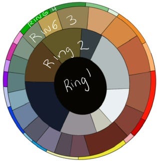
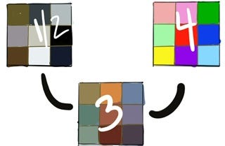
So how to have range in our closet, express ourselves through myriad colors, and still retain our through line? In other words, how do we make sure we look like “ourselves.” The answer’s not complicated, but it does mean letting go of some singular ways of thinking about what color represents. Through the ages, magazines and books on style, have labeled style through either/ors. If you wear colors in ring Ring 1/2, you are an urban minimalist, Ring 3? That’s for the zen masters, yoga matt in tow. And Ring 4, you are fun and girly or the exuberant socialite.
The source of frustration in your closet, or when shopping, has not been driven by lack of choice. Rather, it’s been a bit of a mind fuck undoing what you’ve learned, understanding who you are, and how to articulate that visually through your personal style. You know that being “boxed” into certain tropes is incredibly frustrating, it handicaps creativity and your ability to express yourself without being labeled as chaotic and all over the place (even if it’s just you doing the labeling).
The friction I had experienced in knowing that I crave the stability of classic neutral colors (1/2’s), and the softness of those hard to define ones (3’s) and the excitement of the (4’s) was frustrating. I rejected the notion that I had to pick a lane and stay in it, but at the same time, I often found myself veering in to head on traffic with some of my choices. Not because they were “wrong” visually. By any objective standard, the “outfits” I put together were good. But they didn’t feel right because I simply did not feel like me when wearing them. It wasn’t until a few years ago I started thinking critically about style and that freed me to question question the accepted truisms, debate the logic and evaluate what made sense for me in the context of being a Creative Pragmatist. I suppose it’s why when I created the color wheel (P. 136 in The Creative Pragmatist Book was literally a wheel. Meant to be spun around, moving from ring to ring, with no clear path of right or wrong but simply to help give an understanding of what the different combinations will yield.
Understanding the role color can play to help you lean in to the way you feel can help you think more critically about what you are feeling and how you want to communicate that through your style. When you understand your intent, and are able to convey it visually, it gives you a sense of calm, the calm that comes when you are quite sure of yourself.
Rather than fall for the tropes, the hardcore minimalist, the zenmaster, the extremist, just try mixing up the rings a bit more - adding an “y, light, or an ish” to anything that becomes too one dimensional.
I’m going to give examples of how mixing different rings on the wheel yields different results. I’ll start simple here, showing how one jacket in a ring 3 color can take on different vibes depending on the combination of rings.
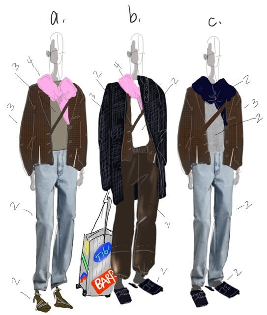
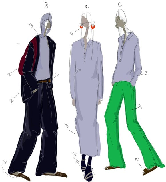
I’ll break down the range of emotions I’ve drawn above:
A: Confident and creative. Maybe this is a more casual day in the office. The heel and the jacket has you squarely put together, mixing the ring 3 colored tee feels thoughtful but not over wrought, and the pink sweater makes you feel a bit happy. The ring 4 sweater balanced with the ring 3 and 2 colors, gives that pink sweater a bit of sophistication.
B: Comfortable but refined. You’re boarding the plane. The white tee keeps everything sharp, casual but put together. The high contrast between the blazer, the tee and the knit has you feeling focused - when you’ve got a long flight ahead, you want to somehow feel fresh and crisp but not strictly confined or overly fashioned out.
C: Weekend effortless but with style. Just hanging, running errands, put together but the literal definition of chillful haphazardnous that all of these ring 2’s piled on convey. That sort of “I just got dressed with the lights off and this all came together” ease.
The illusive Ring 3 is often the glue that pulls together a closet by creating a through line between the rings on the wheel. The daft mixture of Ring 3 allows someone who is arguably chill, modern and classic to retain their sense of personal style whilst mixing in bright colors, strong bold tights, and just creative experimentation.
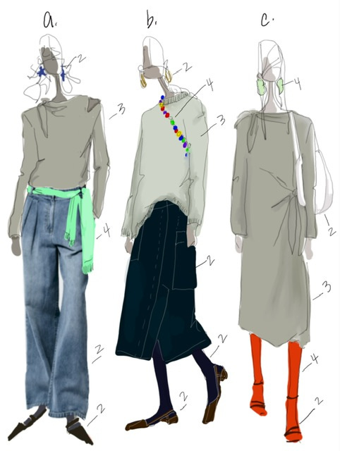
A: The muted but defined color of the draped shirt softens the bright mint sweater and is simply the non-obvious choice that gives an outfit depth.
B: The hard to define sweater color tempers a blazing set of beads, lending sophistication and the good but not jarring contrast to the rich dark neutrals.
C: The bold red sock is balanced out when mixed with the cementy-grey-tannish-brown. Of course we would love the red sock with a navy skirt and sweater too- but you can envision that that would create an entirely different vibe. Not a wrong or right vibe, just a different one.
Here’s a cheat to know if a color is a Ring 3-er. They’re hard to say in one word. We debate them with friends - is it really brown? More red maybe? Possibly a bit purply??? Ring 2 colors can usually be pinpointed straight away: navy. White. Khaki. Grey. Same with the brights or pastels of Ring 4. Fuschia. Lime. Mint. Turquoise. The Ring 3-er’s trip up the tongue a bit.
I know from speaking with so many of you know that many issues with building your personal style emanate from the colors in the closet. Most people have a closet weighted down by either Ring 1/2’s or Ring 4’s. In an effort to expand, balance the scale, they bring in the color ring at the opposite of the spectrum. The thinking being they’ll “brighten” up all the darks and neturals in the closet by adding Ring 4’s and vice versa.
But when you add in the Ring 3 colors, it becomes the glue that brings all the colors together opening up a new range of vibes.
A: The soft purply grey wool jersey lightens up and adds dimension to a a full ring 2 Navy suit.
B: An effortless jersey polo dress gets toughened up and made emphatically urban by mixing in the strength of Ring 2 neutrals and quirky Ring 4 brights.
C: All the bright clothing you’ve invested in have new life and wearability beyond when you’re feeling for something simply happy and creative. Ring 3 settles those colors down extending the wearing options immensely.
Keep the colorwheel near the closet, it will help keep you on point. Practice makes perfect. Which is actually something I don’t believe in. I’ll reword this to say: practice gives you confidence to plow forth and make mistakes and not care because it’s how you experiment and learn and often find they weren’t mistakes afterall. See?
In my opinion, the thought and care given to ring 3’s has been a total closet game changer over the last few years since discovering Tibi. Such a fabulous concept! Your illustrations bring it all to life! Thanks Amy! You’re a genius! Happy holidays!🎄✝️🥂
Bringing in those ring 2 colors totally changed my looks and gave me a much better working closet